
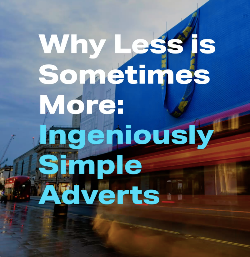
Why Less is Sometimes More: Ingeniously Simple Adverts
Why Less is Sometimes More: Ingeniously Simple Adverts
When a company has strong branding, they don’t need to show much to be easily recognised by consumers. Iconic logos and brand colours are often all that need to be seen to communicate with audiences. By using consistent branding, you can form a lasting connection with consumers, so that they can remember your product with just a simple sign.
There has been a growing trend of brands releasing elaborate storytelling adverts to elicit emotional responses from consumers. John Lewis have become masters of emotional storytelling with their yearly Christmas adverts. The focus of these adverts aren’t price or products but creating an emotional connection with the customer with the objective of building brand loyalty. However, elaborate story-driven adverts aren’t the only way to prompt emotional reactions from consumers. When consumers have pre-established relationships with a brand, sometimes the simplest imagery can evoke an emotional response.
Below are some examples of simple yet highly effective adverts that have adopted the mantra that less is more.
McDonalds, ‘Raise Your Arches’
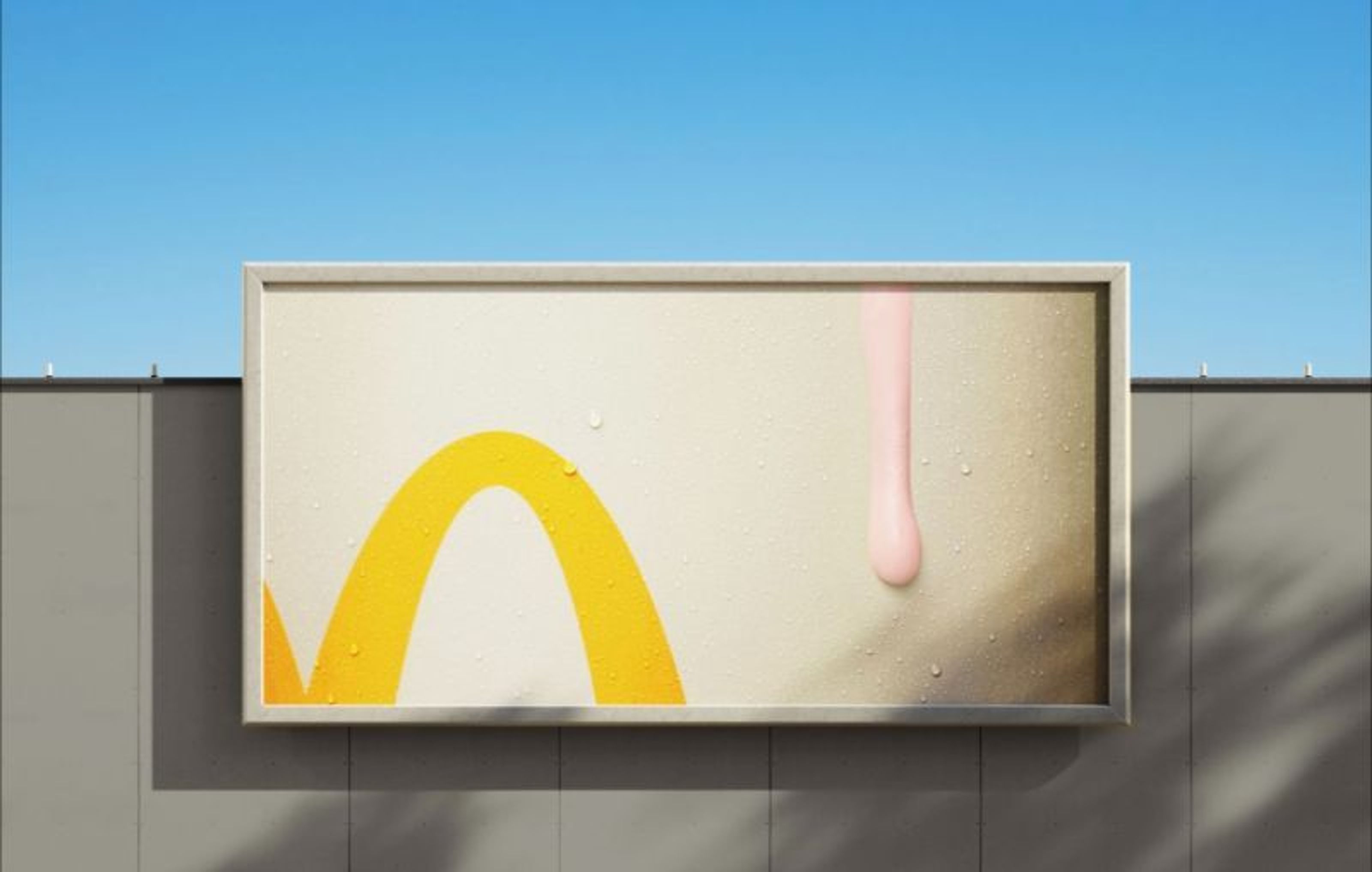
This McDonalds advert showcases the power of branding. With its minimalist approach, the brand conveys a message using simple shapes and colours that quickly resonates with consumers. Even the smallest section of the famous golden arches is enough for people to be able to identify this as a McDonald’s ad.
This advert was released during a recent heatwave in the UK as a continuation of its ‘Raise Your Arches’ campaign. The billboard advert promotes McDonald’s milkshakes, with a design that appears to be melting in the heat. It features just a small portion of the golden arches and a droplet of strawberry milkshake. This advert has no text and no additional branding because it speaks for itself. It creates brand-evoked mental imagery, the majority of us know the taste of McDonalds milkshakes, and only need a simple image like this to jog our last memory of drinking one.
IKEA, Oxford Circus FRAKTA Bag

To mark the opening of a new IKEA store in Oxford Circus, the Swedish brand plastered a giant version of its iconic blue bag onto the side of the store covering the scaffolding.
This advert is a brilliant example of how iconic brand symbols can grab people’s attention and create brand familiarity. Almost everyone has a FRAKTA tote bag at home and the bag has become synonymous with IKEA. In fact, since opening in the UK, IKEA has sold over 3 million FRAKTA bags, which means almost half the country owns one. When passers-by see the façade of this building, there is an instant brand recognition and not mistaking the brand it's promoting.
Pepsi, ‘Better With Pepsi’


Pepsi has a long-running ‘Better with Pepsi’ Campaign where they pair an established brand’s logos with their own.
To celebrate National Burger Day, Pepsi created a simple but effective print advert that used origami made from fast food restaurant wrappers to create their logo, highlighting where the Pepsi logo coincidentally appears. This simple imagery perfectly illustrates the natural pairing of Pepsi and popular fast-food burgers.
More recently, Pepsi ran a similar campaign for National Rum Month, which used the same concept to pair Pepsi with established rum brands.
These adverts work so well because of the recognisability and simplicity of the Pepsi logo. By combining their logo with others, they put out the message to consumers that these brands are made to be purchased together, and many consumers may inadvertently think of Pepsi when they next go to purchase something Pepsi has chosen to align its products with.
Cadbury, ‘There’s a Glass & a Half in Everyone'

Cadbury has achieved remarkable success with its “There’s a Glass and a Half in Everyone” campaign, which has been running for the past five years. These adverts resemble short films, often lasting over a minute, with a cinematic look. The “There’s a glass and Half” series focuses on telling stories of human relationships and shows the small acts of kindness that bring people closer together.
This year Cadbury’s has released a series of simple yet impactful illustrated videos. While they continue to showcase small but heart-warming acts of kindness, they depart from previous lengthy cinematic versions by embracing a bold and simple animation style to convey these narratives. Cadbury’s have shown with the new renditions of the famous campaign that short form and simple video can still generate an emotional response from your audience if your messaging is strong enough.
As you can see, effective campaigns don’t have to be complex. At ewe we understand that often a simple idea can often lead to successful results. Whatever step you’re at in your marketing process, we can help you simplify your brand positioning, creative, messaging or delivery to pack a bigger punch. If you’re interested in benefitting from smart marketing solutions that simply work, then get in touch at hello@ewe.agency or call us on 01943 872505.